For advertising agencies and production companies, Wave Makers is the producer collective that writes music to the cut, not from a library.
An agency has to be able to trust us to the second. So everything around the wave is as tight as a timeline.
The tracks sound like now, made by producers who know what is playing this week. The hand-drawn wave and a sharp, light serif keep the look current.
The difference from a library lies in the choices. One sender, one signature, never used twice.
No gradients, no headphone photos, no aqua-blue waves. Nothing that could come out of a catalogue.
The wave is drawn by hand: a gesture, not a graph. Everything around it is as precise as an edit: timecode, cue numbers, frames. That tension is the brand. A person writing to the second.
We read the two dots of the wave as the 2-pop and the tail pop: the beep two seconds before the first frame and the beep after the last. The start and end of every cue. It is not a rule for the audience. It is a story for anyone who works in post.
Timecode is always written as hh:mm:ss:ff at 25 fps, the European broadcast standard. Cues are named as in film scoring: 1M1 is the first music cue of reel one. Precision as content, not decoration.
The mark stays exactly as it was. The wordmark is new: Geist in capitals, widely spaced, continuing the old Wave Two wordmark. In the logo the name is one word, WAVEMAKERS. In running text it is Wave Makers. Four fixed lockups, one file for the wave, two weights.
Primary, stacked. For covers, the website intro and the end cards of videos.
Horizontal. For navigation, letterhead and slide footers.
Wordmark only. For contexts under 24 px high, such as credits and metadata.
Seal. For social profile pictures and as a stamp on stems and invoices.
Inverted on paper. Black on light, no other changes.
Horizontal on paper.
On ultramarine, always in paper. Black does not reach enough contrast here.
On amber, always in black. Paper does not reach enough contrast here.
Below 48 px the hand-drawn line gets too thin. For that there is a second weight: the same wave, the same shape, only a heavier line. Never shrink the standard weight down to a favicon.
Keep at least a fifth of the wave's width empty all around it. No text, no edges, no photos inside that zone.
Black is the canvas, paper is the text. Colour is a field, never an accent: a whole slide, a whole post, never a link or a button. Two colours, each with a fixed text colour on top. Amber may appear small on black for one thing only: the playhead.
| Pairing | Ratio | Use |
|---|---|---|
| Aapaper on black | 17.6 : 1 | All text |
| Aablack on paper | 17.6 : 1 | All text |
| Aasmoke on black | 6.2 : 1 | All text, including small |
| Aagraphite on paper | 6.4 : 1 | All text, including small |
| Aapaper on ultramarine | 7.1 : 1 | All text |
| Aablack on amber | 9.7 : 1 | All text |
| Aaamber on black | 9.7 : 1 | Playhead only |
| Aablack on ultramarine | 2.5 : 1 | Do not use |
| Aapaper on amber | 1.8 : 1 | Do not use |
| Aasmoke on paper | 2.9 : 1 | Do not use |
Ultramarine is the one blue that does not point to the sea: pigment, Yves Klein, the gallery. Amber is the peak light on a meter, the moment a track hits. Together they are the orange and blue of film grading, pushed to pure pigments. Neither appears in any library brand.
Two families. Fraunces, light, for headlines and statements: the character. Geist for the wordmark, body text, interface and all numbers: the precision. Numbers are always tabular, so timecodes line up.
Music written to the cut, never twice.
Fraunces 300, optical size 144. Open source, SIL Open Font License, via Google Fonts. Free for commercial use.
Wave Makers is a collective of producers composing for commercials, games and social. Every track begins with your edit and is never used twice.
1M1 00:00:00:00 96 bpm F minor
Geist 300 to 700, shown at 400. Open source, SIL Open Font License, via Google Fonts. Fallback: Helvetica Neue, Arial.
Headlines in Fraunces 300, never heavier. Italic only for half a sentence, never for a single word.
Wordmark always in Geist 500, capitals, 0.42 em tracking. Never in Fraunces, never in lowercase.
Body text in Geist 400, at most 62 characters per line, line height 1.5.
No capitals for labels. Timecode and cue numbers are content and are set in the same Geist as the text.
Fallback for Fraunces: Iowan Old Style, Georgia, serif.
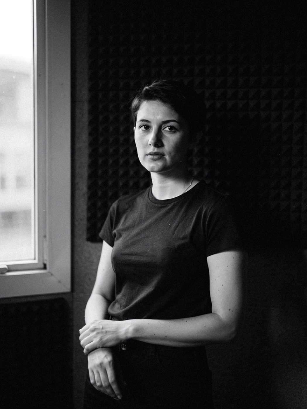
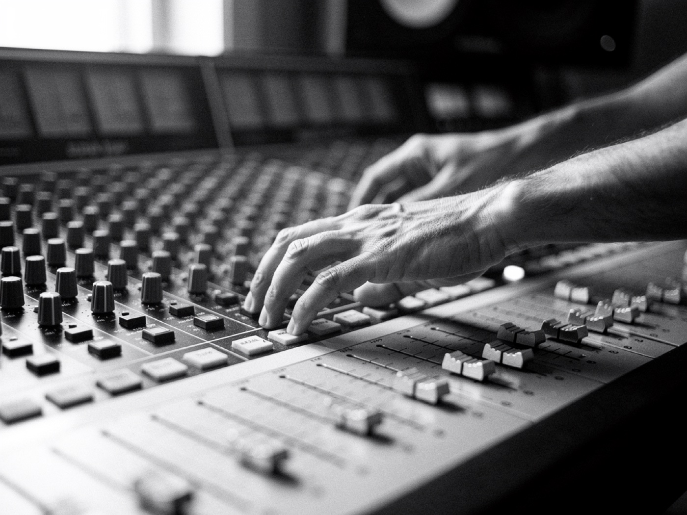
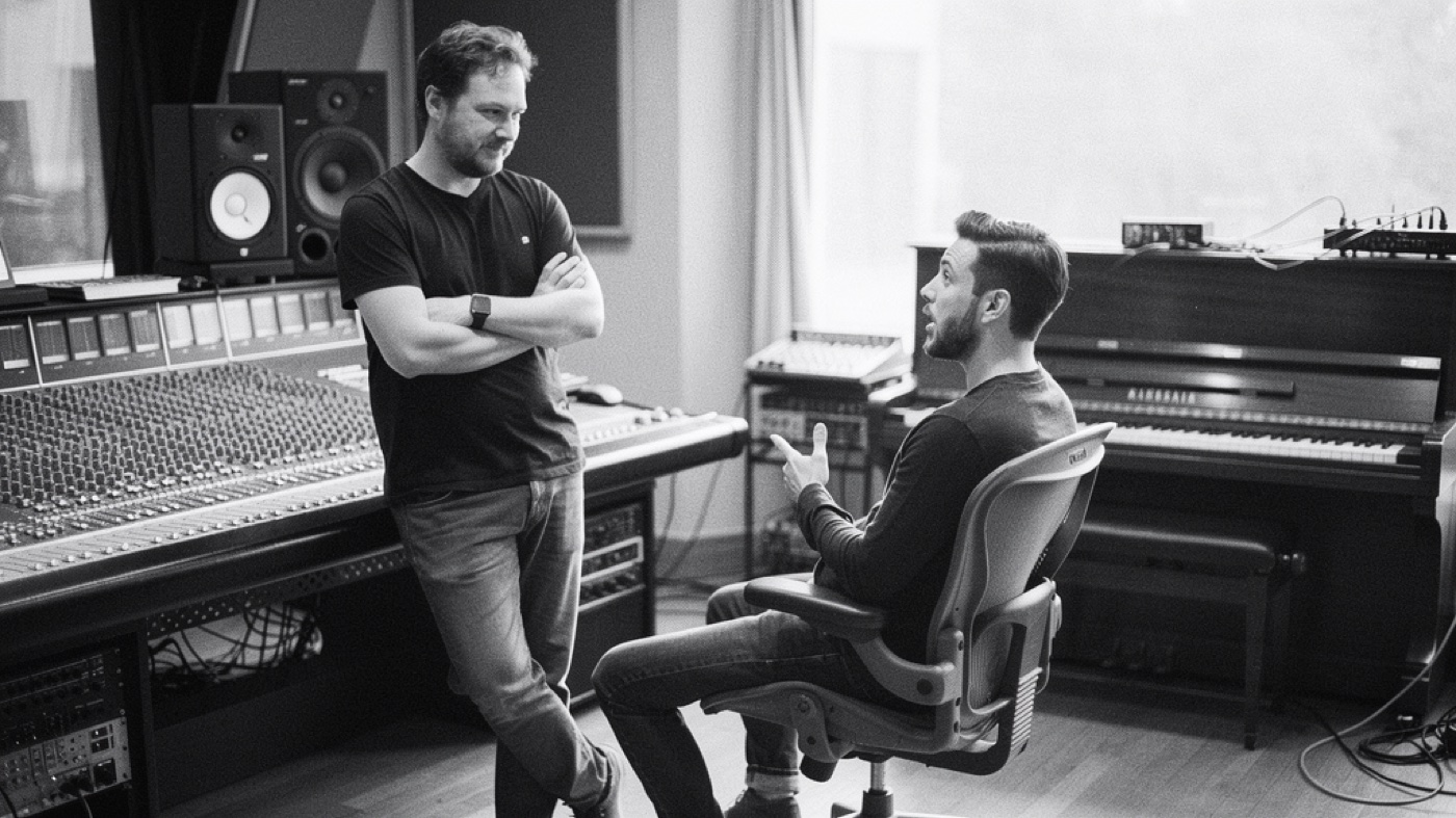
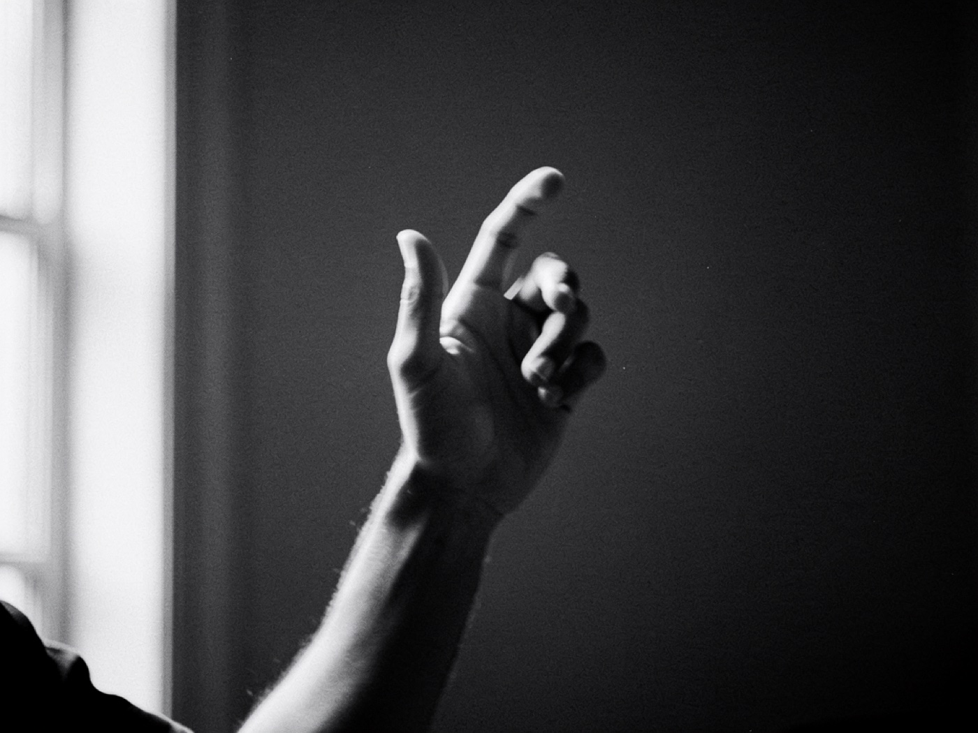
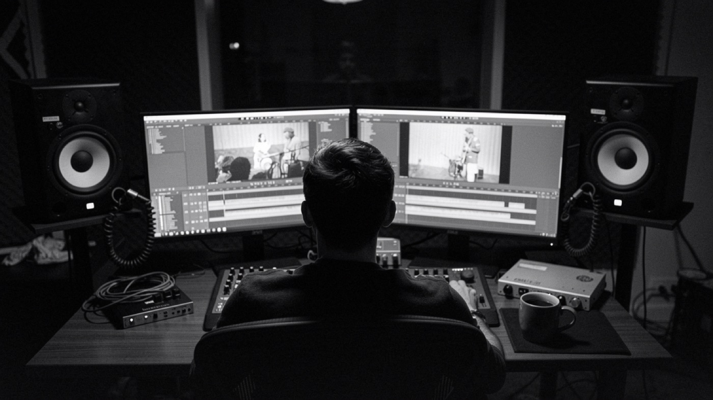
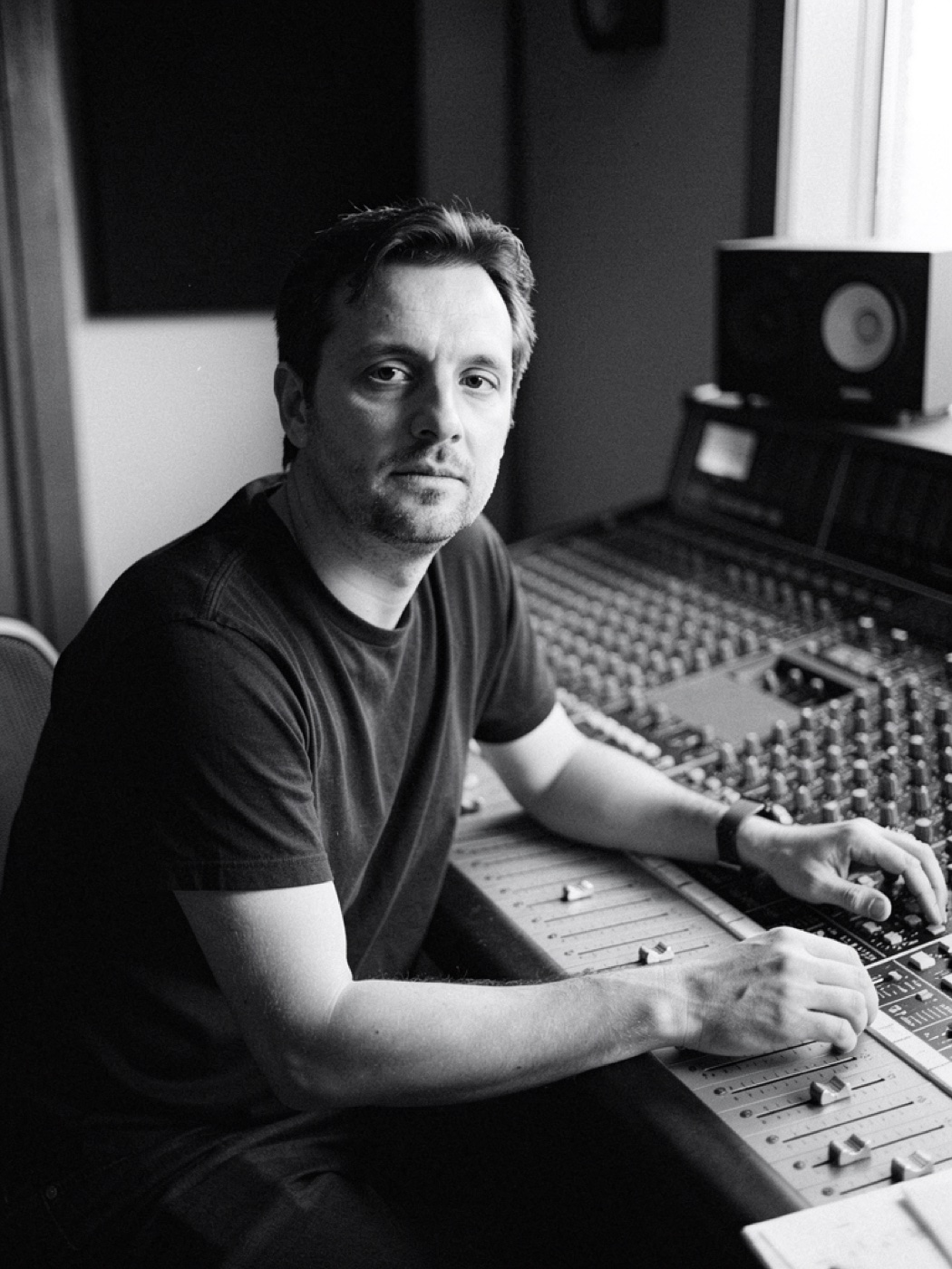
Black and white, 35mm grain, available light. People at work, never posing for the camera. The studio is a workplace, not a set. These six images set the direction for the real shoot with the producers.


Grain is fine, contrast can go deep. Never colour, never HDR, never a filter that smells of an app. Colour in the brand comes from the fields, not from the photo.
Window, lamp or screen. No flash, no neon, no LED strips behind the monitors. If it is dark, it is dark.
No posing, no headphones as props, no sea or waves. The producers appear as an agency would find them at a session.
These six images are AI-generated with Artlist (Flux 2.0 Pro) to set the direction for the shoot. They are not the producers of Wave Makers. Replace them as soon as the real portraits exist, and never publish them as the collective.
Three things only this brand has, because they come from the work itself: the cue sheet, the timeline with its playhead, and the cutdowns. They replace icons, illustrations and stock imagery.
| Cue | Title | In | Out | Length | Tempo | Key |
|---|---|---|---|---|---|---|
| 1M1 | Opening | 00:00:00:00 | 00:00:11:12 | 11.5 s | 96 | F minor |
| 1M2 | Reveal | 00:00:11:12 | 00:00:24:00 | 12.5 s | 96 | F minor |
| 1M3 | Tag | 00:00:24:00 | 00:00:30:00 | 6 s | 96 | A♭ major |
Example: a 30-second commercial at 25 fps. The document producers already deliver becomes the visual system of the website and the deck. Amber marks the cue that is playing.
Every score is written so the 30, the 15 and the 6 each land on a hit. The bars are to scale and return in the deck and on the website.
Website and pitch deck first, social after that. Every example uses only the colours and type on this board. All copy is sample copy.
Music written to the cut.
Wave Makers is a collective of producers composing for commercials, games and social. Every track begins with your edit and is never used twice.
Website, home page. The timeline with the wave is the first image. No hero photo, no video background.
Producers
One sender, six signatures. Every producer has a face and a story.

Producer name
Composer, sound design
Three sentences: where they come from, what their sound is, one cue they are proud of.

Producer name
Composer, mix
Three sentences: where they come from, what their sound is, one cue they are proud of.

Producer name
Composer, game audio
Three sentences: where they come from, what their sound is, one cue they are proud of.
Website, producers. One sender, every producer with a portrait and a story. Portraits in black and white, never in colour.
Pitch deck, 16:9. Cover on black, statement on ultramarine, content on paper. One idea per slide.
Gideon Bus
Producer
Business card. The front shows only the wave on black. The back is paper with name and wordmark.
Three rules that keep the brand from feeling like stock.
Do not stretch it, redraw it or fill it with colour or a gradient. One file, two weights. Only black, paper, or paper on ultramarine and black on amber.
No amber links, no blue buttons, no coloured icons. Colour is a whole field or it is absent. The only exception is the playhead on black.
No sea, no headphones, no neon-lit studio, no audio waveforms as illustration. Images are black-and-white portraits of the producers, or no image at all.
Everything a designer or developer needs to carry on, in one place.